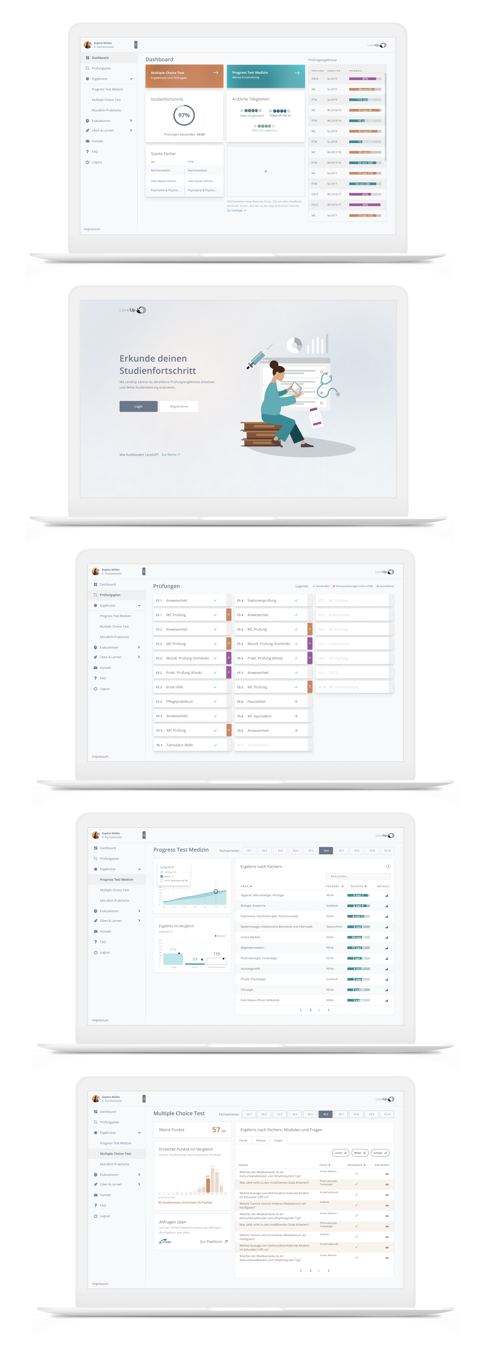
Dashboard redesign
LevelUp is a web app that the university hospital Charité offers its medicine students to keep track of their study progress and check exam results. After students had complained about its difficulty of use and showed little motivation to use it, I was asked to improve it`s user experience by first defining and then finding solutions to address the pain points of the app.
| Year | My Role | Team |
|---|---|---|
| 2021 | UX / UI designer | Project Manager, University Researchers |
Realisation
2021
My Role
UX / UI designer
Team
Project Manager, university department team
Design goal
After finding reasons for low acceptance in a survey the students had taken and analysing the app for use of UI best practices I delivered a redesign of the app including a new style guide and reusable app components.
Goal: The goal was to give the app the visual consistency that would free the students from the information overload they experienced when trying to find information about their exam results on different dashboards.

1. Defining the problems
Survey
Data from a survey that the team had already collected before I joined the project revealed some first feedback on the launched app. An analysis of frequent answers to the open questions showed that thoughts and feelings the students had about the app were mixed - some positive and others very negative.

| Positive: Most students had just tried out the app once after the launch. Many stated that they had no problems using it and showed genuine interest and understanding of its main features: checking the exam results of two different types of test: 1.) the end of term Multiple Choice tests and 2.) the beginning of each term practice exam Progress Test Medizin which is for self-evaluation only. | Negative: Others however had complained explicitly about the non-intuitive interface and menu, and commented with annoyance about "not yet another app!" that they can use to organize their studies. They could not see any more value or advantage in using it. They wished that there would be only one university app that would integrate all the different features that up to now were available over 8 different webapps. |
Heuristic evaluation
Going through the different screens, I documented the good and bad UI practices I found concerning layout, navigation structure, mobile compatibility or Call To Actions. Clearly, the app had problems with following basic Gestalt Principles that made it difficult to find information, charts were not labelled sufficiently or clearly enough for first time users, there were problems with information hierarchy of headlines, and the navigation did not offer enough orientation for the user, especially switching from one dashboard to another.

Task analysis
Before jumping to designing, it was important to define what specific task or question the students are trying to solve or find answers to by consulting the different dashboards. With the information we had from the survey, I mapped out the user journey into 4 different stages the student goes through when wanting to consult the test results of the Progress Test Medizin:
- LOGIN
- CHECKING TEST RESULTS
- EVALUATING EXAM/STUDY PERFORMANCE and
- TAKING ACTION UPON PERFORMANCE

2. Finding and Testing Solutions
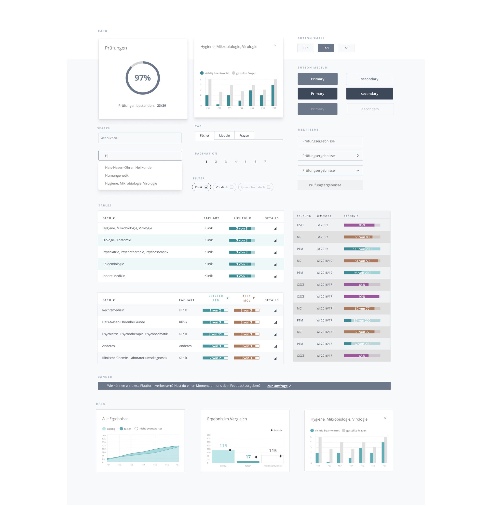
New UI Elements
Overall, it was important to find design patterns and more common UI elements the students were familiar with and can recognize that would not require the students to "put a lot of effort into learning the interface first", like they had commented in the survey. Changes done or elements and styling introduced were for example:
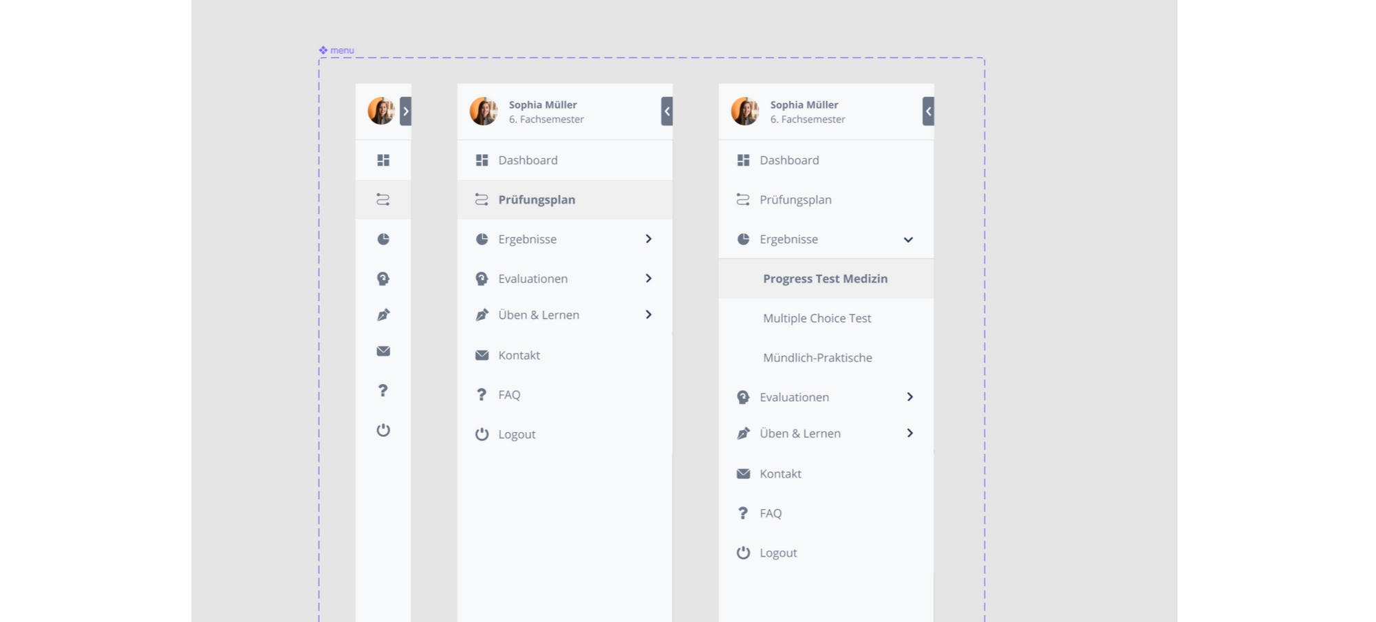
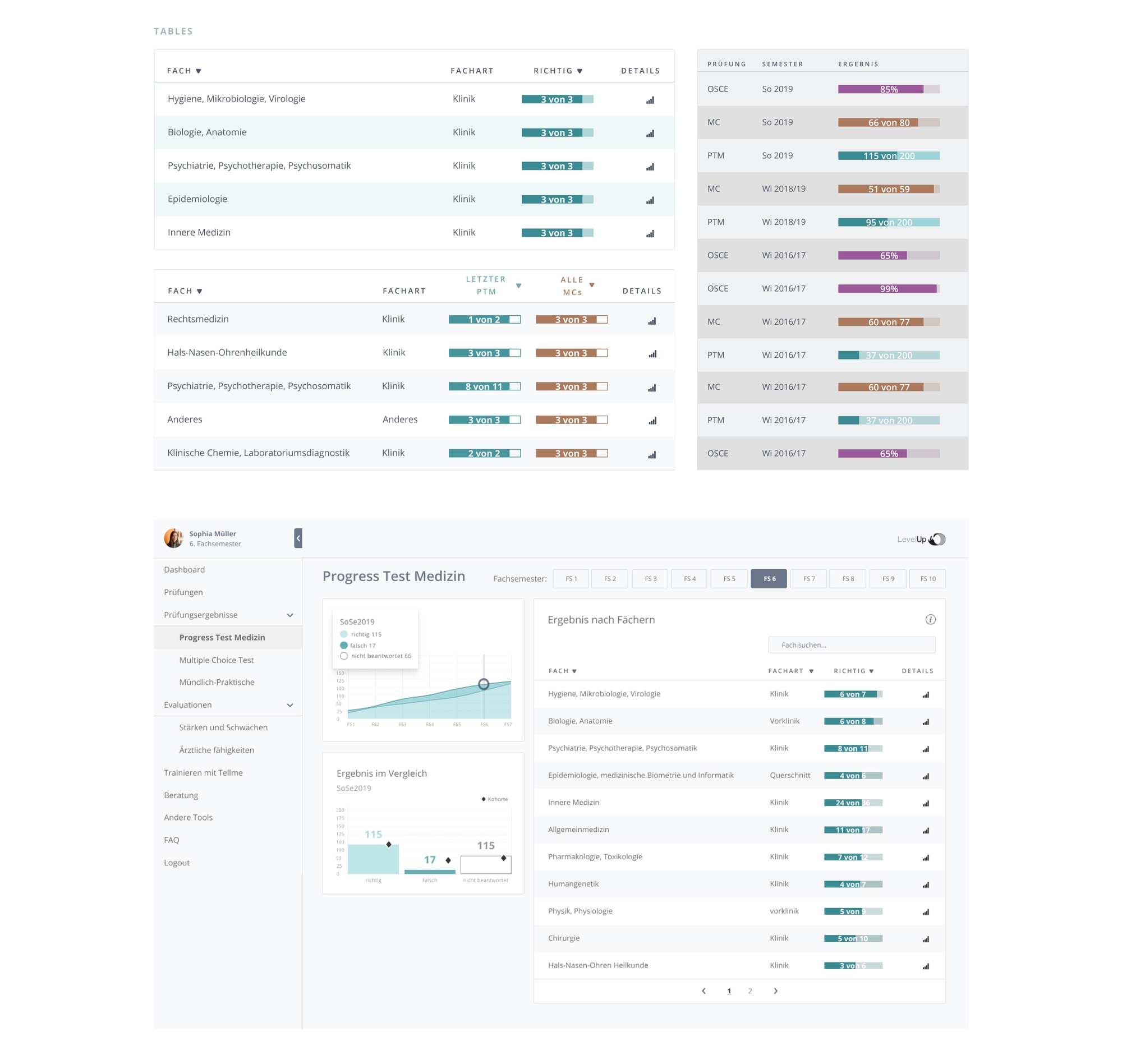
A sidebar menu: is a very common dashboard design pattern. It clearly offers orientation of where the user might be in the app and where to find back to the main dashboard.
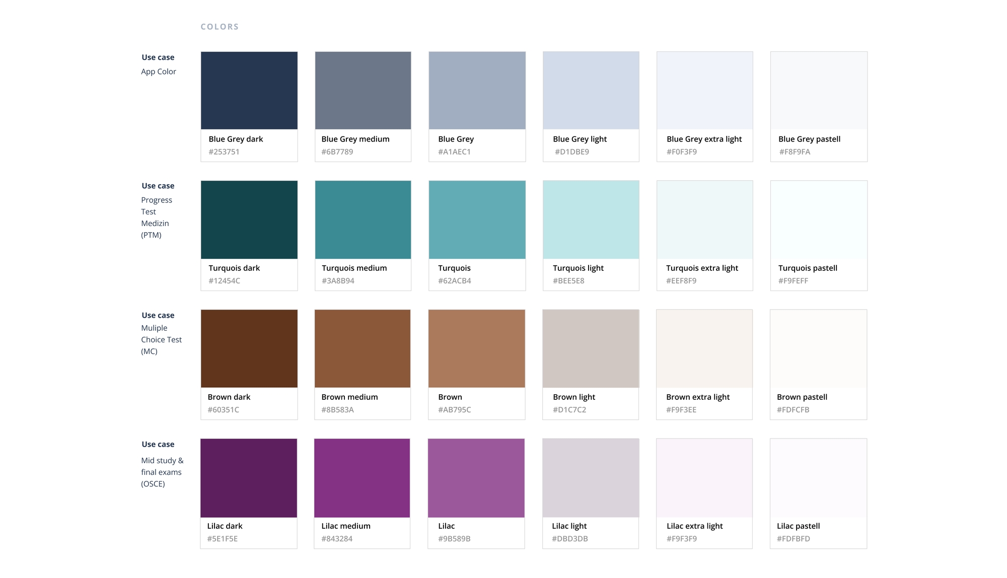
A new color palette: would denote the same color for the same data set throughout the app. Turquois stands for Progress Test Medizin, Orange-Brown for Multiple Choice Test and Purple for Results of Practical and Final exams. Like this a relationship between the data sometimes represented in different ways over different screens is created and can be recognized by the user.
Tables for sorting and searching: To reduce the amount of new learning the students must undertake; I clearly defined the use of tables with sorting function in the detailed dashboard screens. Like this the students can recognize them and work in the same way with the data in each dashboard, even though they are interacting with and exploring different data sets.
Design iterations & click testing
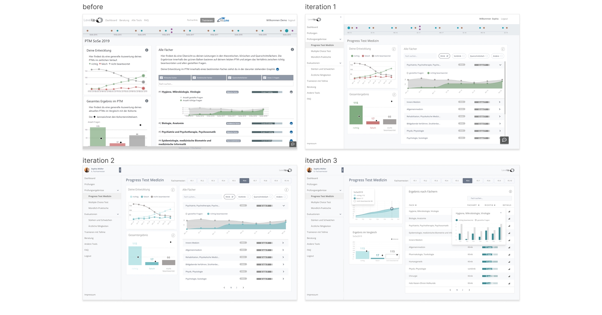
After building a prototype with the new UI solutions in different iterations I set up a click test in order to measure the success of finding information on the dashboards and evaluate how easy the students think it was to find this information.
Design iterations of the Progress Test Medizin dashboard:
Task: where do you navigate/click to find an answer to the following question?

3. Designs
